Magic Square is a Web3 app store
to discover, engage with, and earn from dApps
Overview
The ecosystem covers most of what users do in Web3, including dApp discovery, reward earning, and core token operations.
I joined in early 2024 as the sole designer, working directly with the founders. I owned product design end-to-end on 6 products and built the design system shared across them.
2.5K+
dApps in Store
6
Products Covered
105
Shared Components
182
Icons Designed
Problem
Outdated design. The existing UI didn't match the product's ambition. It needed a more modern visual style to position Magic Square alongside leading Web3 platforms.
Slow design–development cycle. Without a shared library, each feature meant copying patterns, redrawing components, and many rounds of handoff. Too slow for a startup pace.
Cross-product inconsistency. The same UI patterns looked different from one product to another. To users, the ecosystem didn't feel like one experience.
Approach
Discovery and concepts. I started with research and exploration. I talked to the founders, reviewed what existed, drafted redesign directions. I also looked at competitor flows and patterns from products inside and outside Web3.
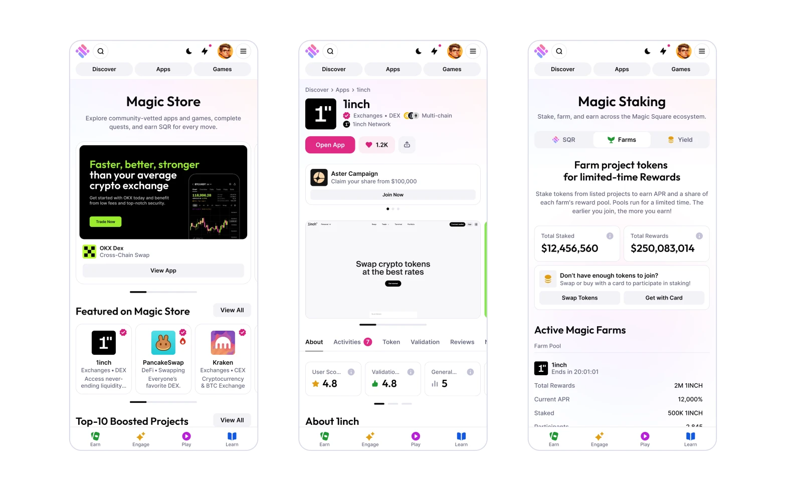
Atomic Design. I designed the smallest parts first and composed more complex components from them. The result is a stable foundation that can keep growing without breaking.
Thinking across the ecosystem. I designed every component with its future in mind. How it would be reused, how it might adapt, how it might extend as the system grew.
Design system
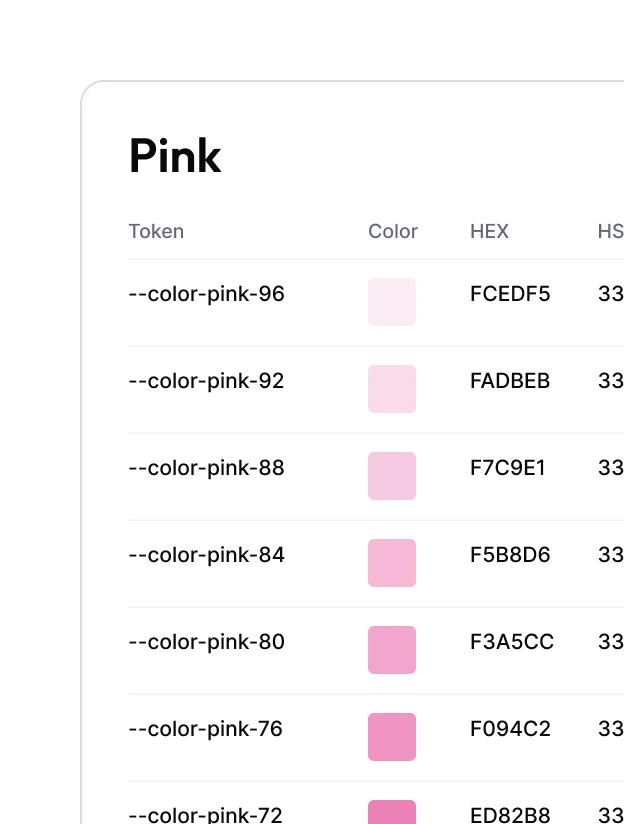
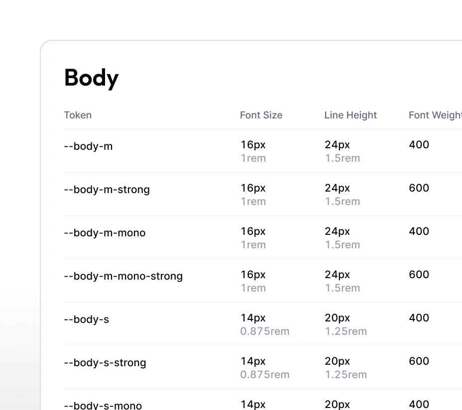
Tokens. I structured the design system around four token categories: color, type, size, and layout grids. Figma Variables held the tokens and synced them with the codebase through dev mode, so design and engineering always read from the same values.
Foundations. With the tokens in place, I built the visual layer on two themes (light and dark) and four working breakpoints. Variables modes applied the dark theme to every screen with no extra work.
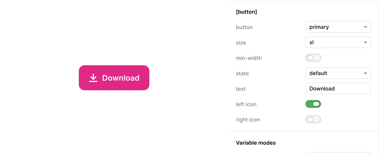
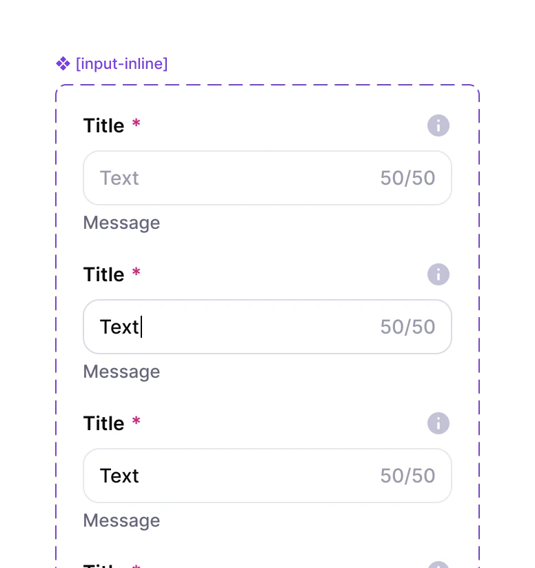
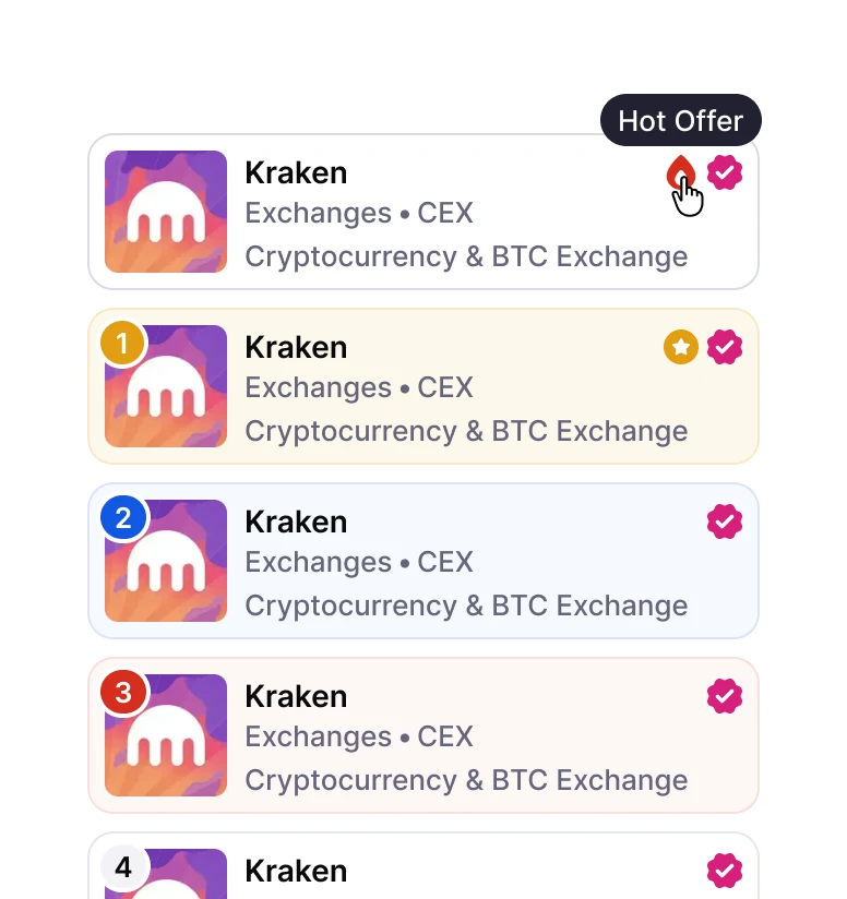
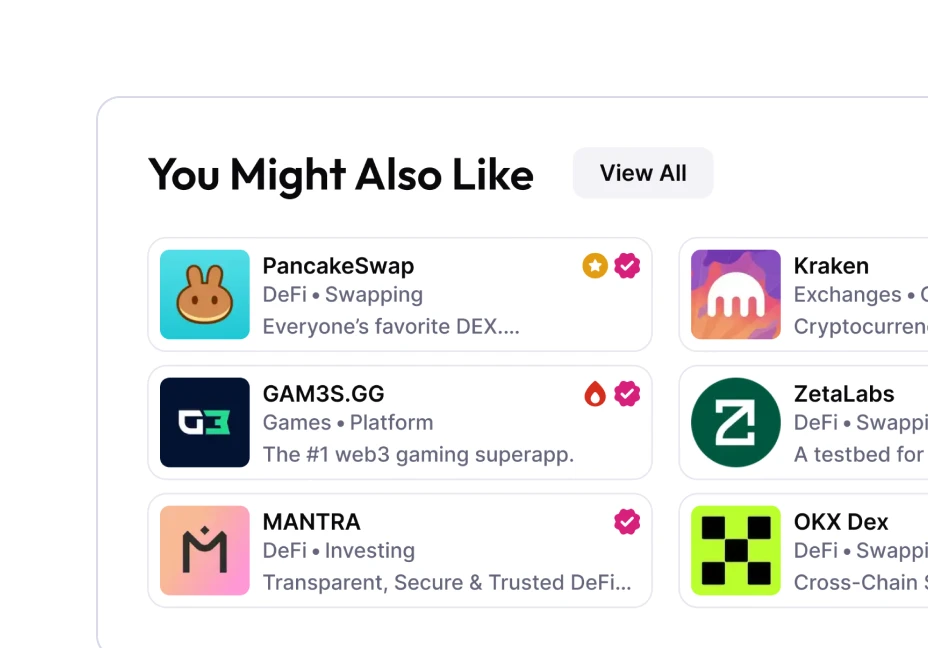
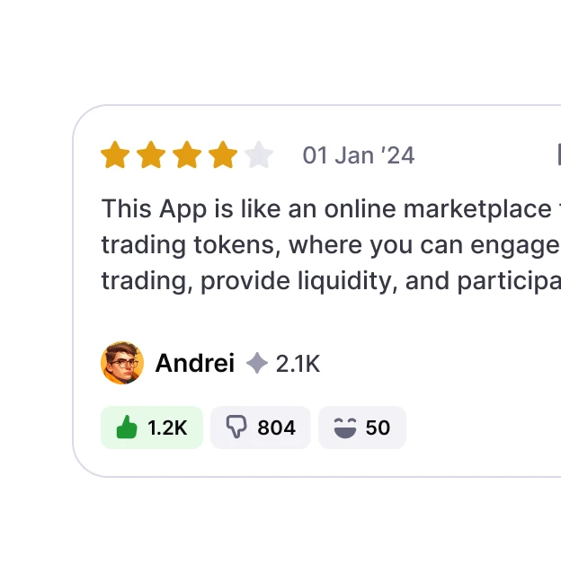
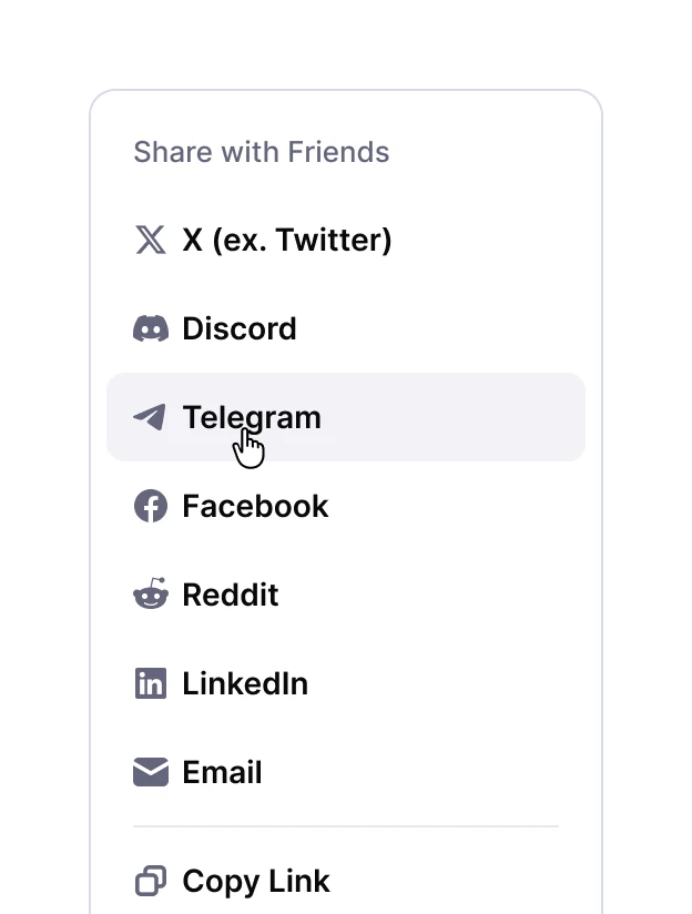
Components. I built a library of 105 components, composed from hundreds of sub-components. Each component included its full state set, managed through Figma Properties, so engineers could mirror the same logic in code.
Icon system. I made 182 custom icons in a single consistent style across utility and product-specific use. The custom set gave the product its own visual character and moved the UI away from a generic look.

Outcome
Unified visual language. The design now runs on one system across all 6 products, with a style that matches modern Web3 platforms.
Foundation for fast work. New features build on existing pieces of the system. 105 token-based components and 182 icons cover most of the basic UI needs and make custom solutions faster to build.
Built to grow with the product. The work gave the project a strong design starting point. The system can keep evolving alongside the product.

Reflection
High-load experience. Being the only designer on 6 products in a startup was the kind of intensity I'd take on again. The pace forced clear priorities and quick decisions.
Speed needs unification. In fast-paced projects, early unification saves the most time. For example, different activities each had their own card design at first, and it took a few rounds before they settled into a single shared template.
Visual language traded for speed. I chose a simpler visual language to ship across 6 products as one designer. With more design capacity, I'd push it further. 3D graphics, richer motion, and more expressive components would match the playful, game-adjacent feel of the product.
